Process
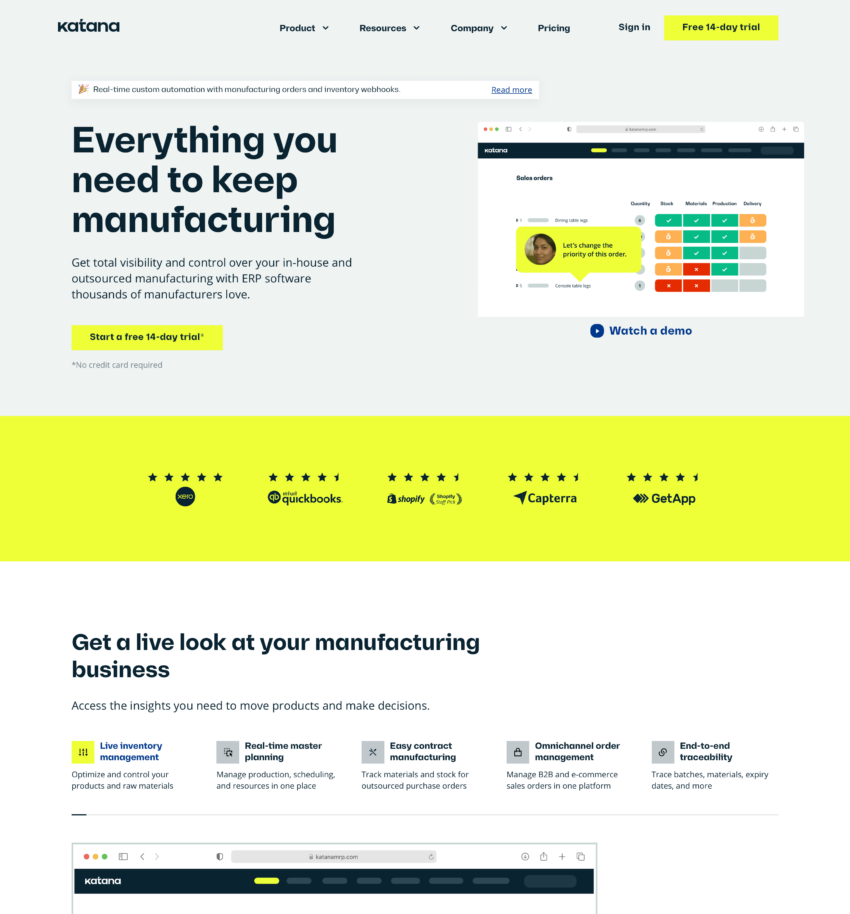
Until 2021 Katana had put minimal effort into branding and their simple visual identity back then was enough to attract micro manufacturers. However, their goal was to now reach more prominent companies and for that, it was necessary to have a more thought-out brand and website. So they reached out to us, looking for a brand and a website update, and as they say – the rest is history.
During the rebranding process with NOPE, they dipped their toes into the idea of a new name but realized during the interviews phase that the name was already perfect with a nod to the craftsmanship and precision of great masters. As they moved on with small, but confident steps towards a clearly identifiable brand identity system, it came to life vibrantly in an array of digital, print, and environmental mediums. The playfulness of the whee character and the familiarness of the new logo got a great response from the internal team, and it all went off to make its mark inside the team.
The newly refreshed brand provided a great foundation for the website. Since the timeline was tight, we started building the website as the brand and web design were still in the final stages. From the fine-tuning of the green color hex value to changes in the layout between pull requests, it was somewhat confusing, to say the least. We also can’t forget the role of the new information architecture and content overhaul in this project. Because of this, hundreds of pages of content needed to be migrated by hand. The website has over 70 (crazy!) different sections to accommodate their need to build new pages as they go, 5 different hero variants, and 10+ completely unique page templates. We collaborated with animators and focused on movement and micro-interactions and despite all that multimedia content, the fast page speed and overall performance were one of our top priorities. The entire development process was agile and iterative, and the main principles were scalability and optimization.

