the challenge
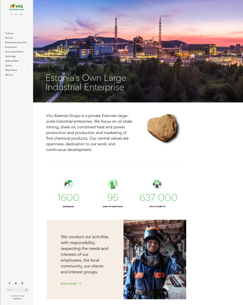
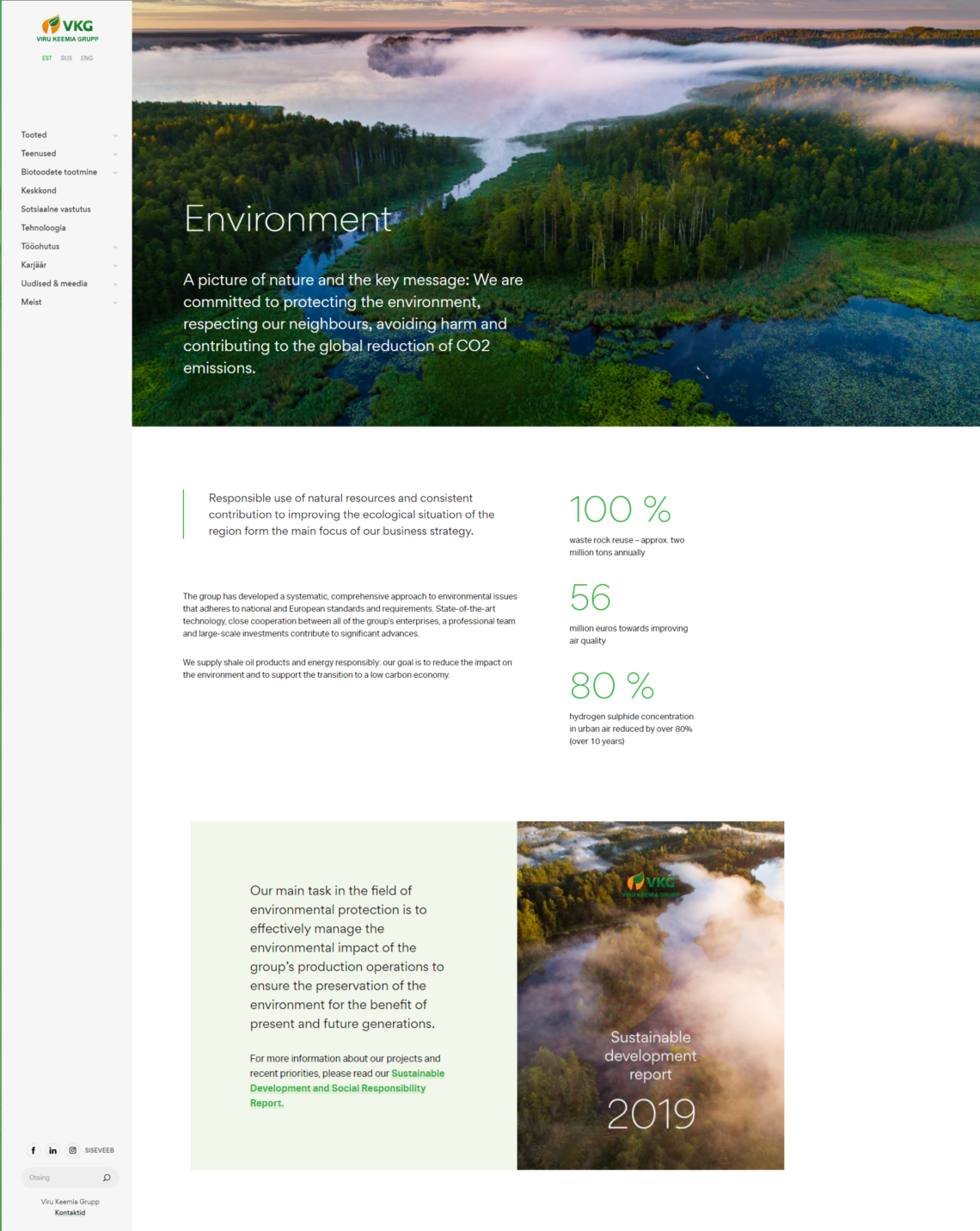
Together with designer Oliver Oberg we created a modern functional environment, which looks amazing both on desktop monitors and on hand-held devices. Unlike the traditional development method, where we create views for all the different screen sizes separately, we approached the problem a bit differently this time around. Using a width-flexible framework, we started with the desktop views and with small efforts adjusted them to fit the design to a small screen according to the designers instructions.
It was very important to the client that it would be as easy as possible to create pages with a complex structure and with a certain design style. This particular requirement together with the unique design posed an interesting challenge for us. Creating a bunch of unique modules that intertwine with each other is apparently quite difficult. To bring this into perspective, it’s as if every module were a piece of lego and the client can stack those lego blocks on top of each other just as they see fit.
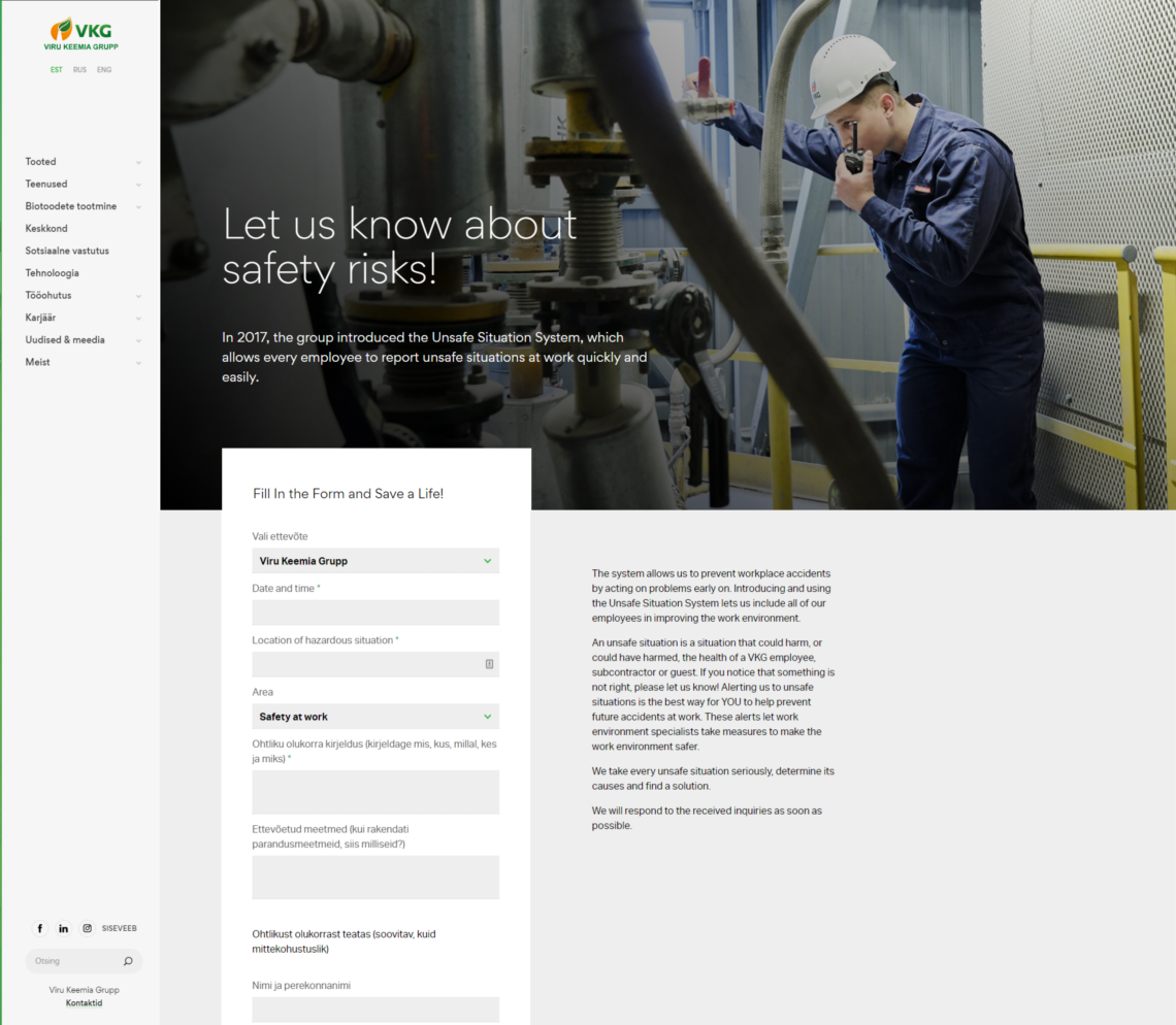
Furthermore, we implemented the news archive and the gallery structure that was previously in the old web into the new web. We also created a solution where every employee can now create posts through an online form in case something dangerous occurs in the factory. The same post system will automatically be used to report the incident to the whole in-house system as well.
We also created interactive report pages for the annual VKG yearbooks and sustainability reports that go all the way back to 2014.


