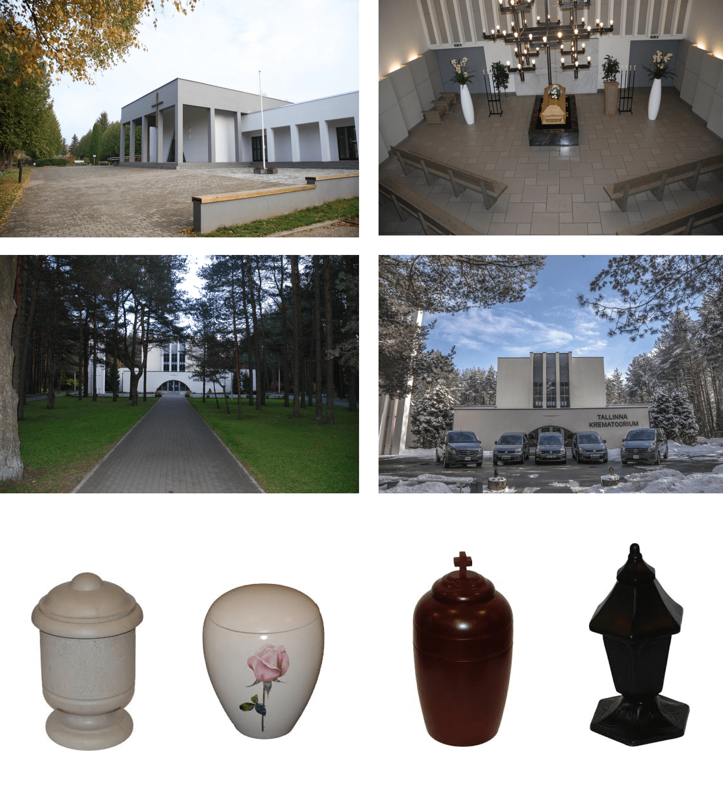
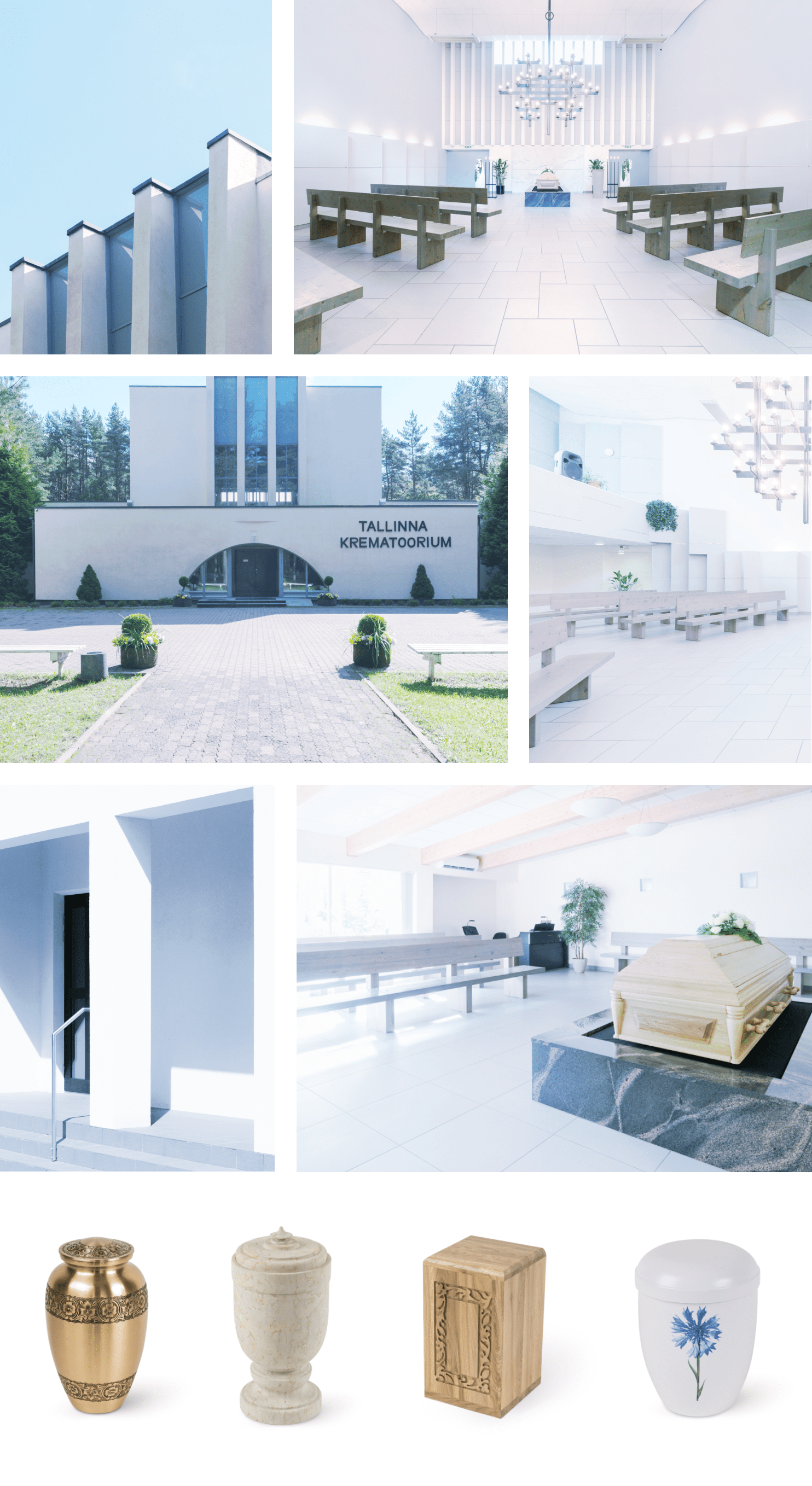
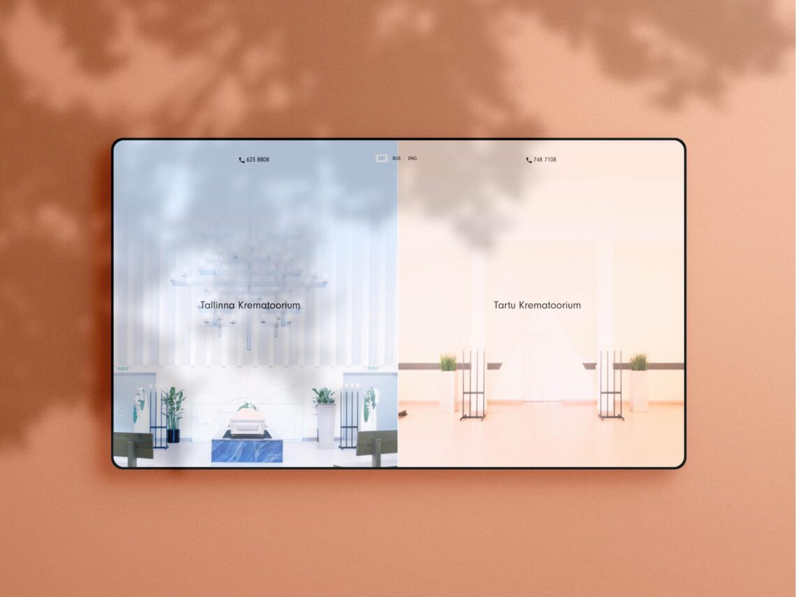
a total makeover for a business that will never cease to exist

Services

Business analysis, Design, Front-end development, Back-end development, System design and architecture, Testing, Project Management

team

Nele Erikson (NOPE) ui/ux and product photos
Andres Gallardo Albajar Architecture and interior photos
Juhan Valge front-end
Sander Orav front-end
Ivo Klaas back-end
Pärt Erikson back-end
Ardo Aednik PM

Visit the site

Background

Tallinna Krematoorium AS is a cremation service company that offers cremation, grave, and urn funerals in Tartu and Tallinn. The company was founded in 1993 and was the first to offer a service like this in the Baltics. 

The innovative team of Tallinna Krematoorium AS realized that as delicate a subject cremation is, it’s still a business like any other and needs to function with the same goals and principles. In order to stay competitive, the team decided it was time to take the steps to bring the funeral business into the digital world. 

Before the combination of two web applications that we created for them, all of their funeral planning was done literally with pen and paper. Pretty much everything about the process was the same as it was 20 years ago. Now they have an awesome 21st-century website along with a back-end system that has optimized a lot of their work and given their overall brand a great boost.
The challenge

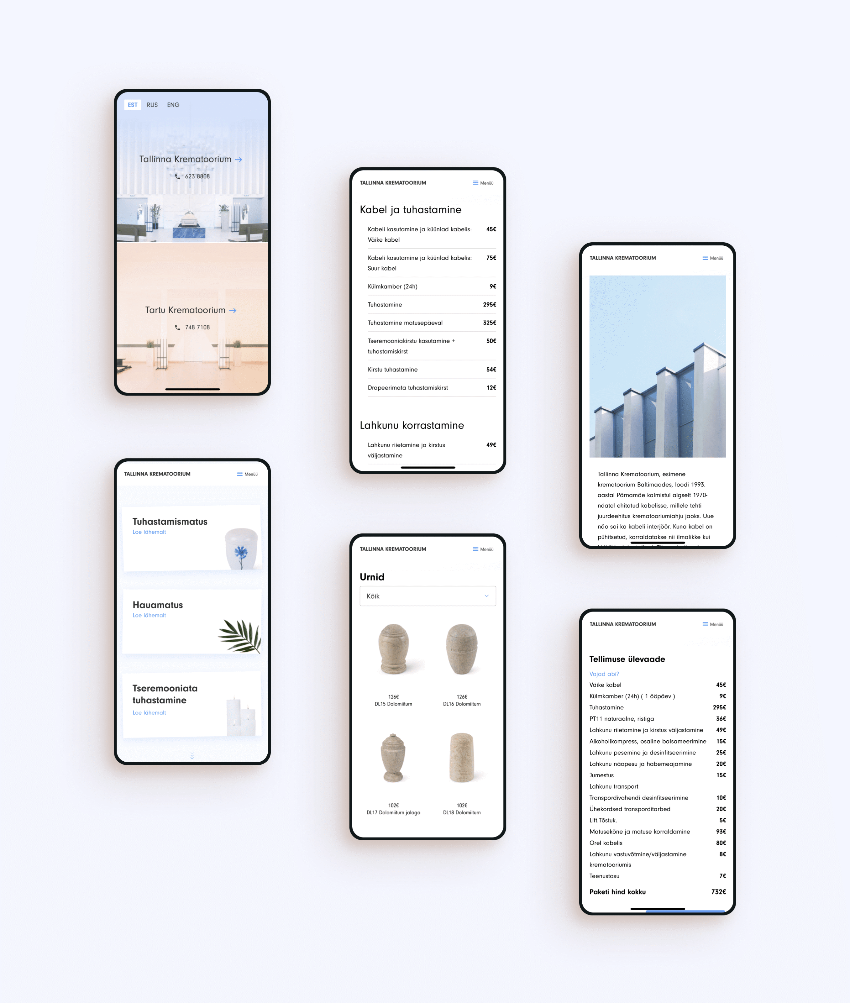
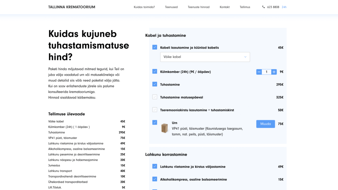
Because dealing with funerals and organizing different aspects of it does not tolerate any mistakes we needed to create a solution where it would all be made as easy as possible for the different administrators to manage everything on the website. Design-wise the website needed to be as far from intense and frantic for the customer as possible as to not create or amplify any emotions related to the reason which brought them there in the first place.

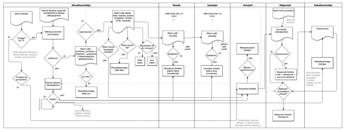
One of the first steps in business analysis is to understand how the business operates. Waterfall schemas are really good to visualise the processes across different roles.

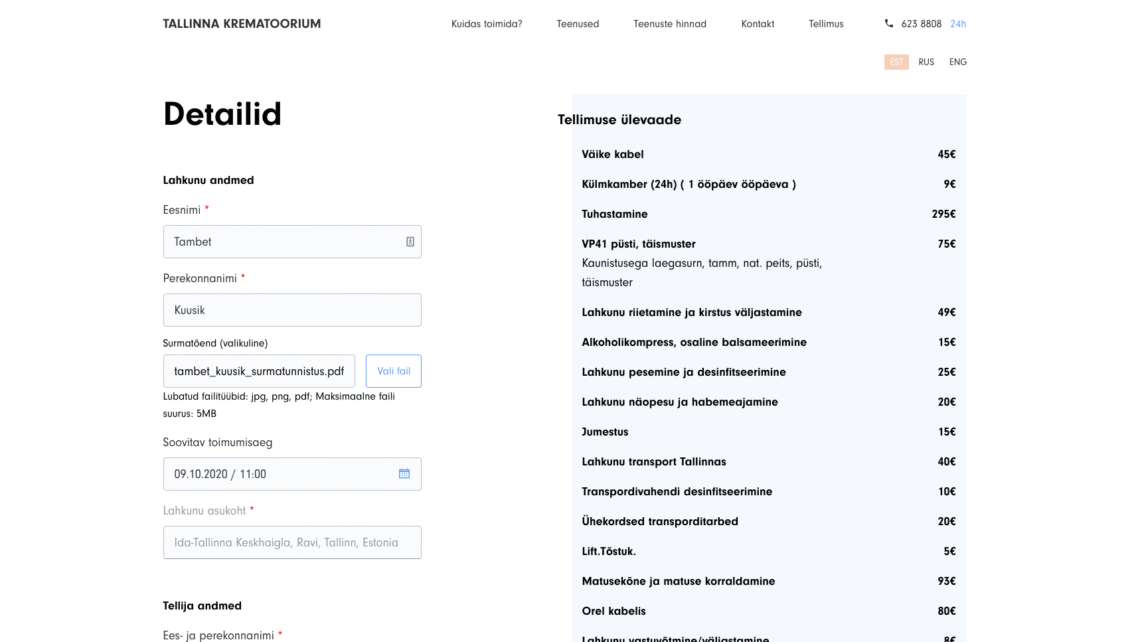
When the client approached us, they knew what they wanted to have changed, but didn’t really have a specific vision on what the end product would look like or how to achieve it. One of the problems they faced was that the business up until this point was not scalable. That gave us a chance to analyze the company and the hardships of the work thoroughly to make the best product tailored exactly to the needs of the client. At one point we realized we needed to create two supplementary faces for the product – We had to make a customer-facing including everything the end-user would need and a tool for the workforce to manage time and resources.


The long journey to results

The whole project is the result of a two year process of constantly improving the product. Our development in this project was MVP-based. This meant creating small solutions few at a time so that the client could test them out and provide feedback. Piece by piece we began putting together a bigger picture that would come together as the best possible solution. 

Our process started off with analyzing their business and our project manager Ardo had a chance to work there for a couple of days to get a better understanding of how they do their jobs and what are their current weaknesses that we could begin to improve. The entire approach to the project was a blast for us here at gotoAndPlay. We rarely get the chance to do projects that allow us to go so deep into the business and actually work there to get better insight. Thanks to the experience we gained, we could build the exact tailored product that our client needed.

In developing the website we used languages, which we know best – PHP, Javascript, HTML, CSS and MySQL.


End user facing

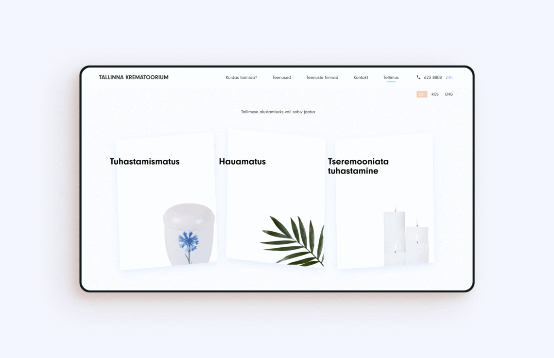
Throughout the whole process we kept in mind the most important aspects of the product – simplicity for all generations, calm design and an increase of scalability for the company. We used calming tones for the website and kept the content as informative and short as possible. It is also worth noting that you can start the whole ordering process from home.

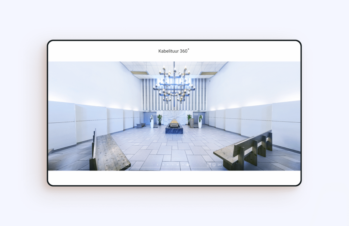
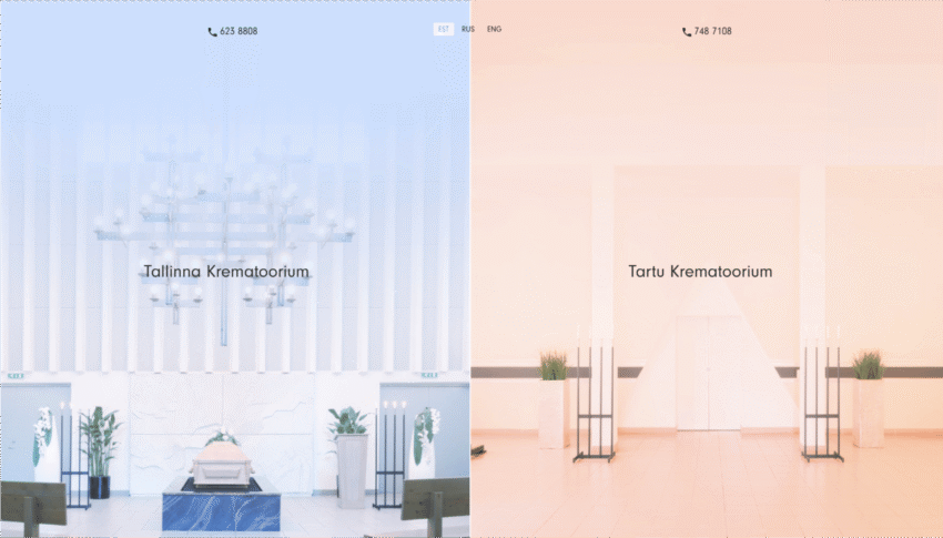
Designing products for the elderly does not mean that we have to use the same solutions that were popular years ago so that they are already familiar with the technology. No, it is the intuitiveness and just the right amount of content attached to the details that makes a website comprehensible for all ages. For example, to have a better view of the chapels while using the most up-to-date solutions, instead of the all-too-familiar gallery view, we decided to go with an elegant 360 degree solution where you can wander around freely inside the chapels and have a look at the building from the outside as well.

Tool for employees

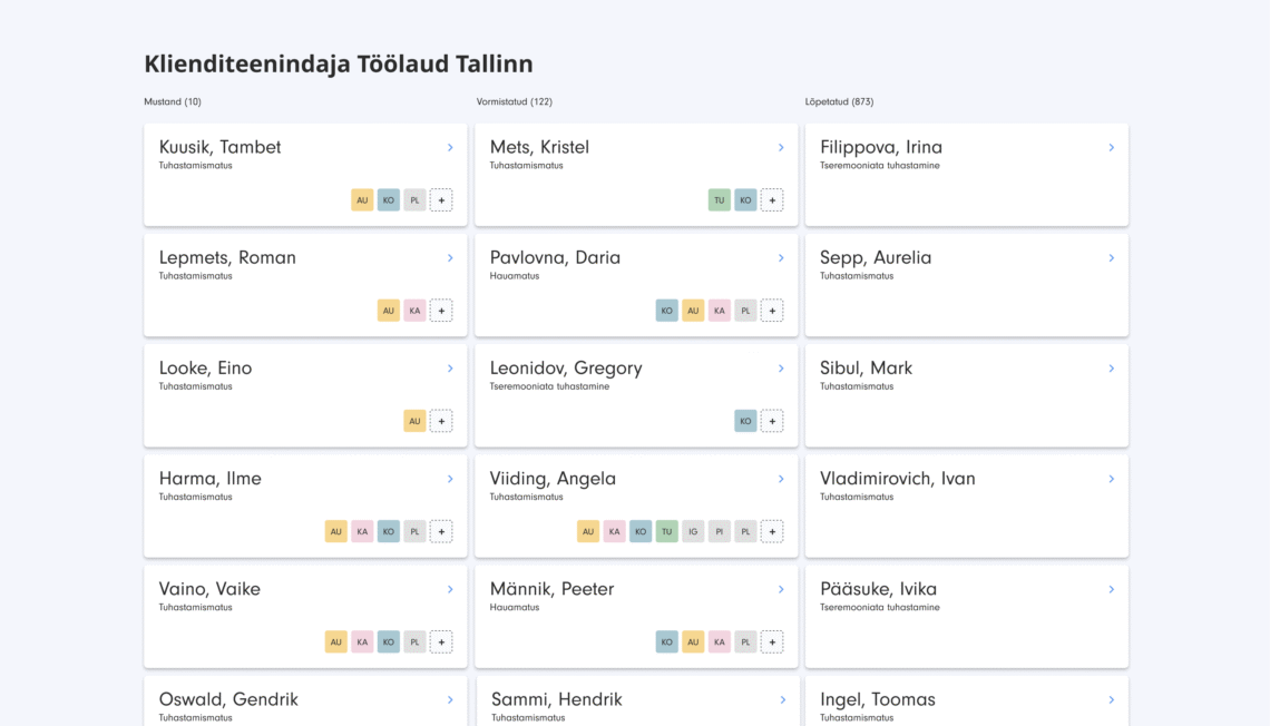
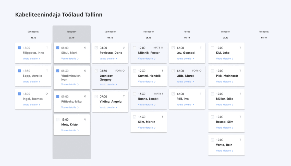
In order for everyone in the workplace to know exactly what their role is, we needed to create a task manager (like JIRA!)  that would help organizers communicate changes in plans faster and put everything together more efficiently.

Whether it be the car driver or the pastor doing the ceremony, they required a way to see where and when they needed to be at a specific location. 

We also implemented a triple notification system, where the worker can accept and receive tasks based on their preferences and the nature of their work on a tablet, through an e-mail or an SMS alert. That is to ensure that everyone is informed of their obligations and are up-to-date with all the changes in plans at all times.

Furthermore, an accounting program got integrated into the tool as well. When an order has been fully processed, it is automatically sent to the accounting program where contact cards are created and the revenue is added. The whole automation of this process has optimized some of the work that is usually quite troublesome.

The future

Thanks to the product being a flexible solution, it will start shipping as a SaaS (software as a service) as soon as possible. The system can be customized according to the funeral traditions, business size and regional regulations, so it will be offered to businesses in the same field all across the Baltics and some of the scandinavian countries.

That would make Krematoorium AS a company which organizes funerals and sells software to others so that they could also have a possibility to modernize and scale their business even more. It is an inspiring example on how to transform a local business into a global service.

feedback

A simple, intuitive and a pleasantly bright user interface design has helped our customers to arrange their funeral ceremonies without additional stress. The solution is good at easing the heavy burden at the most difficult time. From the product side, the new solution has given us the chance to bring new digital opportunities to funeral services in Latvia, Lithuania, Finland and Sweden. The system can be customized according to the funeral traditions, business size and regional regulations.

Lauri Maldre
Tallinna Krematoorium